Building a business is not an easy endeavor. There are a lot of things to consider, like taxes, products, innovative ideas, and of course, marketing strategies. One of the most effective marketing strategies is to advertise a product in a witty and creative way as this gains attention from the public who will then share your ad around.
Of course, the process of conceptualizing a creative ad is not done overnight. It takes time, a lot of brainstorming, and the combined effort of many people for a brilliant concept to be materialized. These 40 creative ads are sure to raise your eyebrows and get you thinking, “how did they come up with that?” Read on for plenty of laughs and some hair-raising moments.
Coca-Cola’s Crane
Coca-Cola is one of the most prominent sodas that a lot of people crave. Aside from creating desirable products, Coca-Cola is known for coming up with creative strategies to promote its sodas.
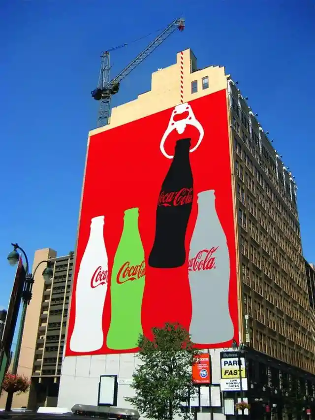

What’s so cool about this billboard is that it looks like the crane is pulling up the bottle. According to Coca-Cola, this only works while the building is under construction. When it is finished, they have to find another place to put this artistic billboard to make the interaction realistic.
It’s McDonald’s Time!
McDonald’s could be the winner for the best advertising strategies. From social media to our TV screens, newspapers, and the billboards we pass on the freeway, their advertising department is doing a great job at making the brand ubiquitous.
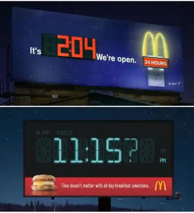

This billboard shows that no matter what time it is, McDonald’s is ready to serve its people. These billboards tell you the time and confirm that you can stop in and enjoy a break at McDonald’s. By offering drivers this courtesy, McDonald’s scores many extra customers each day.
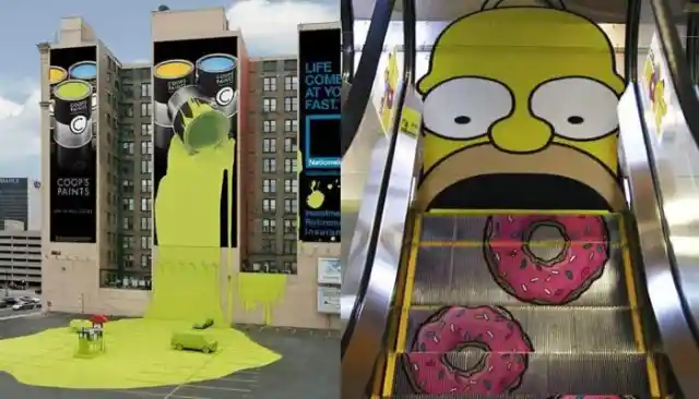
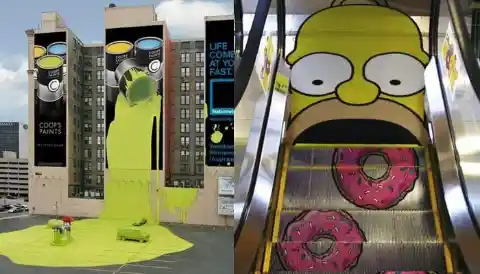
Nationwide Insurance or a Paint Product?
Advertising people are born to be creative. With so many ideas rushing about in their minds, they can sometimes present a confusing message. However, as you scratch your head trying to figure out what this scene is advertising, you naturally pay more attention to it, making it far more memorable.

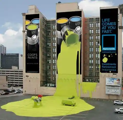
At first glance, you would think that they are promoting a paint product, but as your eyes scan the scene, you realize they are advertising an insurance company – something that is difficult to advertise creatively. A lot of people think that insurance is just an additional bill to pay, plus nobody wants to talk about the future. Whoever is the brain behind this advertisement, kudos to you!
Royal Baking Powder
Food is one of the few things that can easily be advertised, and one of the easiest products to sell is cake. Creating a building-sized cake is a great strategy for igniting people’s cravings, but it’s especially relevant for the ingredient this brand is selling.


In this case, the company needed to advertise baking powder – the ingredient that makes cakes rise. Of course, it makes sense to create a billboard that looks like a fluffy and delicious sky-high cake.
The Brilliant McDonald’s Coffee Lamp
Since we know that McDonald’s is the lord of advertisements, it’s time to share another of the company’s creative ways of promoting its products. This one involves the famous breakfast menu.


At first glance, you would think that it’s just a clever Photoshop job, but this street lamp is the real deal. The coffee pot is the lamp, the pouring coffee is the lampstand, and the cup is the base. Brilliant!
Dropping Cingular
Cingular was first discovered when they released their slogan, “raising the bar.” People thought it was brilliant because it can be taken to mean adding additional signal bars. For a cellular service that has that kind of slogan, people would expect much more of their future advertisements, and in fairness, they did not fail.
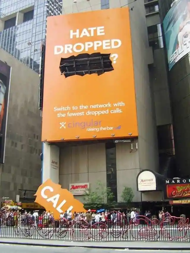

It took us a while to fully grasp what’s the meaning behind this billboard. If you will think about it, the word “call” was dropped from the billboard, which perfectly sums up the frustration of dropped calls and poor cell service. What a brilliant ad this is!
Imagine a LEGO Universe
The LEGO brand has always gone hand-in-hand with an active imagination as it requires creative thought to bring the different scenes you create with the blocks to life. If they are brilliant in the development of their products, it stands to reason that their advertisements will be brilliant as well.

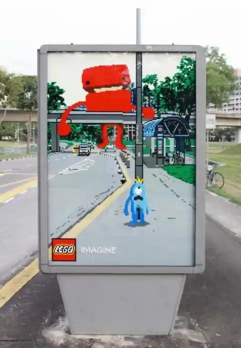
There is no limit when it comes to LEGO – you can do and imagine anything you want. This is the same ethos LEGO follows when creating their billboard, inviting you to see a magical world in even the blandest setting. You can definitely imagine anything with LEGO.
Calvin Klein – Just Add Water
Calvin Klein is famous all over the world for their classy undergarments, so a billboard that contains these products is not new for them. However, the advertising director clearly had access to an abundance of creative juices while conceptualizing this idea.
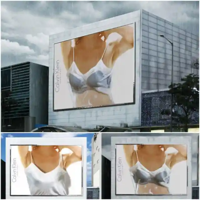

Whenever the sun is around, it just looks like a photo of a woman wearing a silky white slip. However, when the rain pours, the white slip gets soaked and becomes transparent, revealing the Calvin Klein lingerie underneath. This water-sensitive billboard is out of this world!
Honda Fit
“Fit whatever” is the slogan that Honda is using to promote their new car. It might be cliche because of their product’s name, but as they say, the simpler, the better in advertising. Consumers can easily understand what this means.

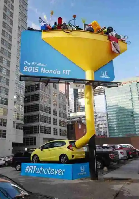
People are often looking for a car with a more sporty look, advanced technology, and a lot of safety features. On top of= this, Honda emphasizes the spaciousness of their small car. It may be zippy and fuel-efficient, but that doesn’t mean you won’t have space for all your stuff. Clever.
Prestige’s Giant Pan
Most cooking equipment companies sell their products with the use of food. Showing how strong and durable their equipment is and how beautiful it is, even if it is just cooking equipment. However, with Prestige Omega, the company decided to promote its product without using any food.

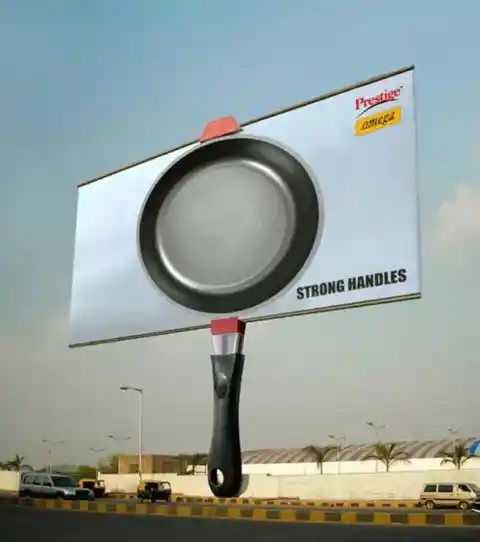
They want consumers to know that their product is strong and durable, just like this billboard. They highlighted how strong their handles are knowing that when pans break, it’s usually the handle that’s the problem. Thanks to this billboard, customers are able to see that this pan won’t let them down.
Oskar Jensen’s Unique Advertising Campaign
How do you advertise an advertising company? Upon thinking about it, they are the ones who must be witty and creative so that their future clients will trust them, and this is what Oskar Jensen did to make their clients say “yes” to them.
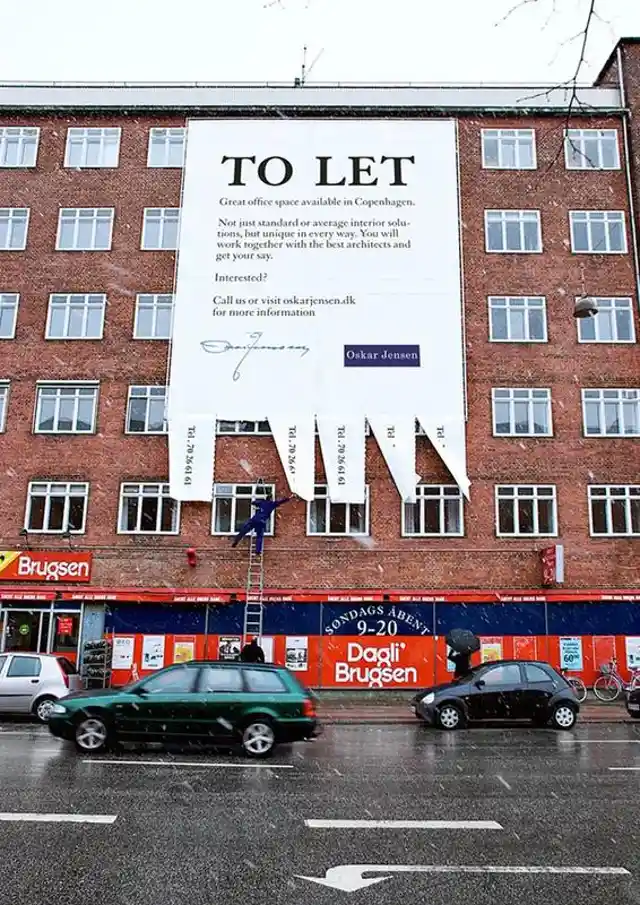

Oskar Jensen’s strategy was to remind us of how simple advertising can be. This billboard is indeed an eye-catching advertisement. However, we hope no one tried to climb up and grab one of those phone number tags!
McDonald’s Secret Burger
If there is one company that has a lot to share in terms of creative marketing, it’s Mcdonald’s. Now and then, they create witty and artistic advertising campaigns, and they never fail as they are one of the biggest burger chains in the US.
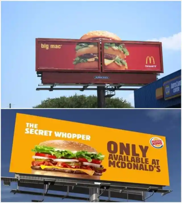

If you can see this big billboard burger while driving on the highway, you might take a re-route to go to a drive-thru at McDonald’s. It’s fun to see that Burger King is jumping on the creative billboard bandwagon, but we’re not sure what they’re going for with this campaign.
Where Do Radio DJs Come From?
It’s not always rainbows and butterflies when it comes to advertising. Not all people will love it. Some ads make the people baffled and angry at the product and the company promoting it. This is what happened when Kiss FM, a local radio station, made a billboard that declared these kids were ugly.

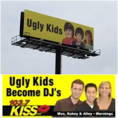
However, the bad publicity worked out as they then released the second part of their billboard wherein they declared, “Ugly Kids Become DJs.” Apparently, the kids on the first billboard are the DJs of the radio station. Although we know that the company just wants to get attention, the billboard was highly criticized.
Hair Club – Here to Help
Balding is an issue many men have to go through at a certain age. This is why there are so many products that focus on hair growth or concealing baldness. How can you advertise it without being harsh and making people feel bad about themselves? This billboard might be the answer.

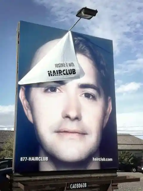
Without too much text or explanation, this billboard was able to show the problem and the solution, which is obviously their product. Thanks to the slogan, “restore it with hair club,” everyone knows where to turn if they’re worried about their hairline.
The Simpsons Movie Nailed Its Advertising
Advertising is not just limited to billboards, TV, or social media. It can be as witty as putting an advertisement on an escalator, just like what they did when they advertised The Simpsons Movie with Homer eating donuts.
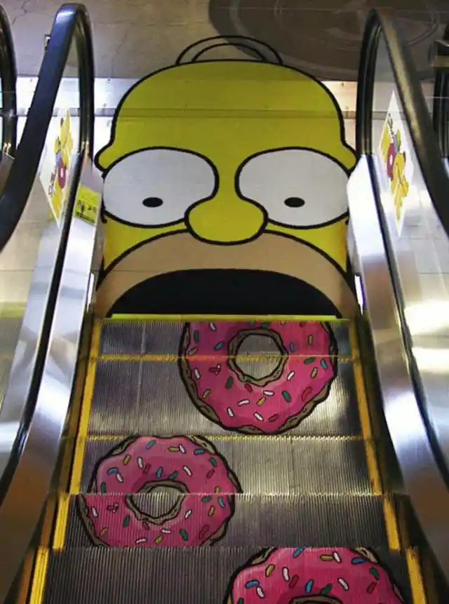

It certainly gets the attention of anyone riding the escalator. However, it seems difficult to understand what they are promoting. Is there a new donut shop? Or a shop selling Simpsons merchandise? Without the movie poster on the side, it would be hard for people to perceive the purpose of these donuts.
92.2 FM Bass County
This is one of those hilarious and witty advertising campaigns that no one is ready to see. The people behind this radio station are courageous, and they were happy to take a risk with this kind of advertising.
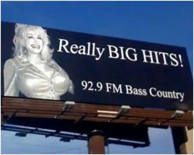
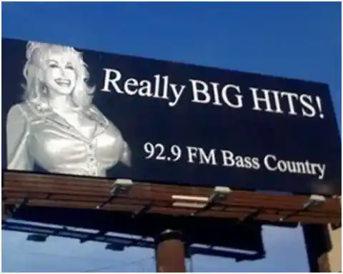
They put “Really BIG HITS!” as their slogan, but that picture of Dolly Parton adds a clever double meaning. We don’t know if this advertising received any backlash, but one thing is for sure – this is funny and witty at the same time.
Science World’s Diamonds
Science World is a science center located in Vancouver, Canada. As the name suggests, this museum and interactive space provides facts regarding science. They produced billboards that contain little-known scientific facts for people to get familiar with their company.

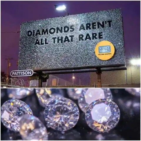
At first glance, you would think that this is a jewelry company that sells diamonds, but no, the tagline, “We can explain” makes people want to understand the truth about diamonds. This goes to show that advertising is not only about being witty and creative. Sometimes, it helps to be educational and informative.
The Day After Tomorrow Movie
This movie is probably one of the best apocalyptic films of all time. Aside from creating an epic trailer and featuring the movie poster at malls, what other way could there be to advertise a movie like this? The marketing team got extra creative when they came up with this wild idea.
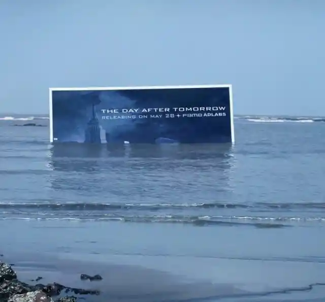

This billboard portrays the after-effects of the movie wherein natural disasters took over the world. This one is the most creative yet, with the billboard placed in the ocean to make it look like it was ruined by the calamity. If this was just placed on a highway, there wouldn’t be anything special about it.
Apple’s iPod
Before there was an iPad, there was the iPod – a pocket-sized device that allowed you to listen to music on the go. How could a small item hold so much music? That’s the beauty of technology. How could this billboard be so brilliant? That’s the beauty of advertising.
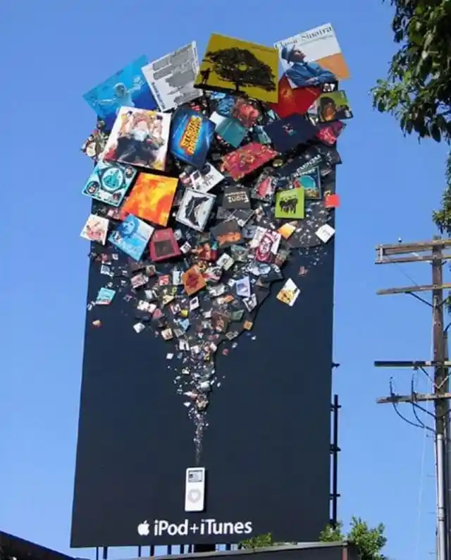

Apple is known for its innovative technology and designs. With the continuous emergence of different gadgets under the Apple logo, it seems that they are not running out of ideas. Then again, aside from being great at developing new technology, who would have thought that they are also innovative in terms of their advertising?
Allstate Car Insurance
As we said, insurance is difficult to advertise. People don’t want to talk about it because it symbolizes adulting and seems like just another bill to pay. However, Allstate gave insurance a big push forward with their advertising, letting everyone know why insurance is so important with this terrifying billboard.
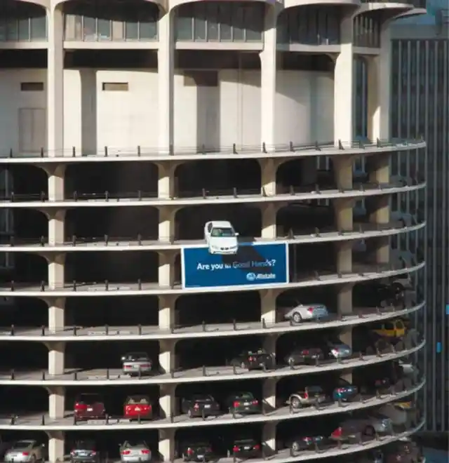
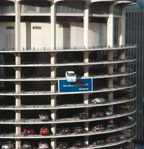
We panic whenever we see a scenario like this. For sure, there would be lots of police, people taking pictures, medical teams, and reporters on the scene. It would be terrifying to be in a situation like this, which is why Allstate highlights it using their slogan, “Are you in good hands?” In other words, if this scenario happened to you, would you have peace of mind?
YOLO at Wilks Funeral Home
This billboard is bleak, funny, realistic, and hopeful all at the same time. #YOLO (You Only Live Once) is the slogan of this funeral home company. It sounds scary yet funny, right? While this billboard might be insensitive for some, many others think it is brilliant. After all, it’s true that we only live once.

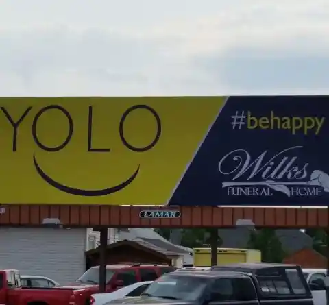
#BeHappy is also included in their advertising campaign, reminding people to be happy and live their lives to the fullest because when you go to the other side, you will not have a chance to do anything about your regrets. It’s powerful, especially because it comes from a funeral home.
Desperate for a Toilet Break?
Most of the wittiest billboards we see are actually quite simple. There are no lavish designs, only plain text, and plain graphics. This billboard was designed by Tony Godzik for the Detroiter Travel Center, and you have to admit it gets the message across loud and clear!
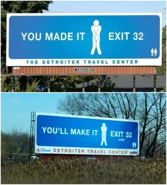

This bathroom symbol is something that we are all familiar with, and it perfectly captures a predicament we’ve all faced at least once on a long drive. This billboard assures people who need to go to the bathroom that they are on their way and will soon find relief!
Colorado State Patrol’s Warning
Unlike private companies, government offices don’t usually use this kind of advertising because there is nothing that can be promoted to the public. However, if the government sees that billboard advertising is effective in promoting a specific product, maybe they can promote a more important message.
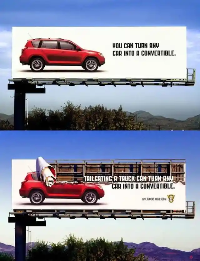

Colorado State Patrol proved that you can use billboard advertising in promoting important, life-saving announcements. The billboard gives a warning to drivers that if we drive too close to a truck, it can turn our car into a convertible (and not in a good way). We applaud the Colorado State Patrol for promoting safe driving.
FedEx Kinko
There are a lot of things that can be advertised, and one of those is office supplies. There are countless creative ways to advertise such products, and of them looks like this:

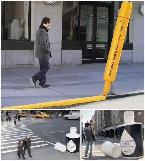
FedEx Kinko’s way of advertising office supplies is just superb! Imagine if there were oversized markers and other fun items you could on the streets. These fun ads were surely a hit with the people who passed by them. We wonder who the mastermind behind this campaign was.
SunChips’ Shadow
This billboard advertisement requires the participation of the environment to make sense. SunChips is known for creating its product using green energy. So, what better way could there be to advertise SunChips than with the sun?
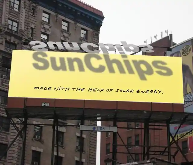
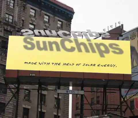
When the sun is shining, it sheds light on the billboard, revealing the company’s name above their slogan, “made with the help of solar energy.” It indeed captures the interest of potential consumers of these marvelous chips.
McDonald’s – Eyes on the Fries!
McDonald’s takes the prize for most creative ad campaigns. “Eyes on the fries” is their slogan this time, but you should have your eyes on the road while driving or walking right? McDonald’s is not wrong though – we’re all craving fries right now!
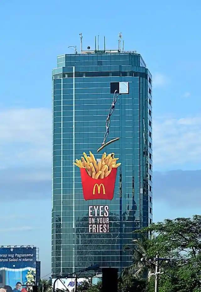
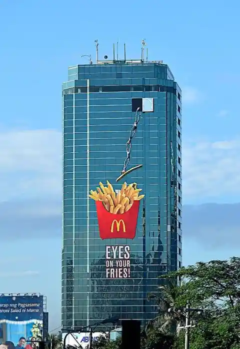
The picture of a large fries on a big building is eye-catching, to say the least. It also highlights a common thing that happens when you get fries – your friends all want to dig in and take them from you, even if they said they weren’t hungry. Lesson learned – always buy extra fries.
This BIC Razor as a Lawnmower
One good thing about advertising is that there are endless ways to do it. You can do anything you want, be it simple or extravagant, interactive or not, as long as you do it right. We love the creativity of this BIC Razor ad – the oversized razor appears to have done the work of a lawnmower.


You cannot see any taglines – only the oversized product, the name of the company, and the cut grass which shows how powerful the BIC Razor is. The only problem is, they need to maintain the grass because if they let it grow, the message of the advertisement will be reversed. Maybe the company thinks that it is worth the trouble?
DHL’s Giant Box
If we are talking about ideas being outside the box, DHL is the one to do it because they literally use boxes for their service. In this instance, DHL did not fail – we can’t imagine a better way to advertise your heavyweight shipment capabilities.

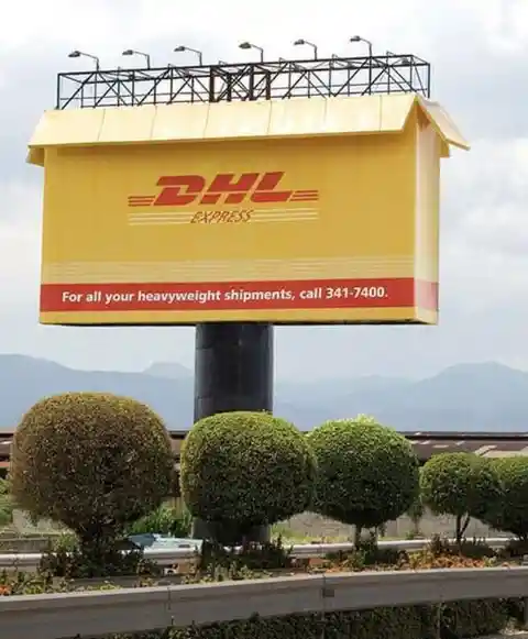
Instead of using pictures of delivery workers transporting DHL boxes, they featured a boxed billboard! It was a plain and simple yet eye-catching ad that deftly got the message across.
Dutch Stutter Foundation
Just like the Colorado State Patrol, this billboard promotes an important social message and raises awareness of stuttering, which is considered a disorder.

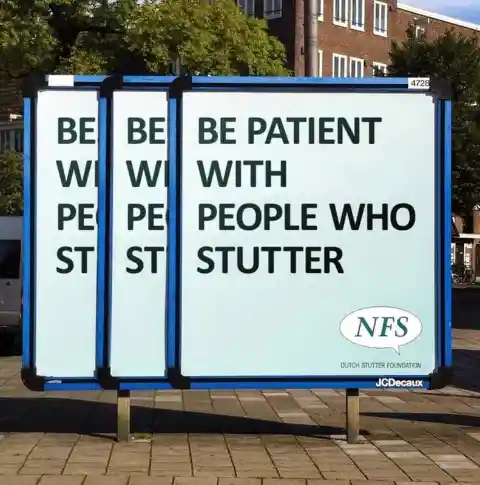
As people pause and read what’s on the billboard, many will be caught off guard as they try to understand what life is like for those who have this disorder. It is indeed a clever approach to spread social awareness.
A McDonald’s Sign at Night
Here’s yet another smart advertising brought to you by McDonald’s. The message is simple – they are open at night and willing to serve people who are driving under the light of the moon and the street lamps.
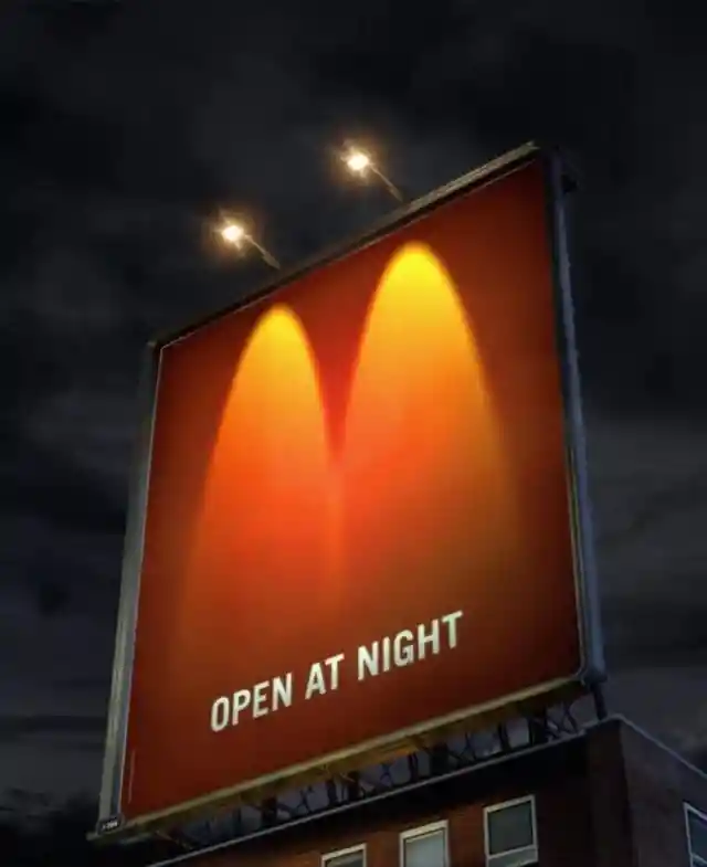

Two streetlights were used to produce the famous “M” of Mcdonald’s. Though the idea is simple, it is powerful enough to capture your attention. It’s almost like the signal Batman receives whenever there is an emergency. Well, it’s an emergency if you’re hungry, isn’t it?
BBC’s Dracula with Knives
When a new movie or TV show is about to be released, it is important to build up public anticipation. In this case, the BBC was intelligent enough to design a special kind of billboard when promoting their new show, Dracula.
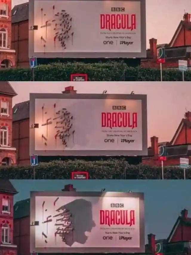

We think that it is brilliant! At first, it doesn’t make any sense because it’s just a bunch of knives in a random position; however, as the sun goes down and the billboard lights start to shine, the shape of Dracula is visible in the shadow of the knives.
Mondo Pasta – You Can’t Let Go
Aside from the billboards, you can put stickers or advertisements in random places, so long as you get approval from the owner of the location. This company made a smart move by incorporating pasta as a rope securing a boat.
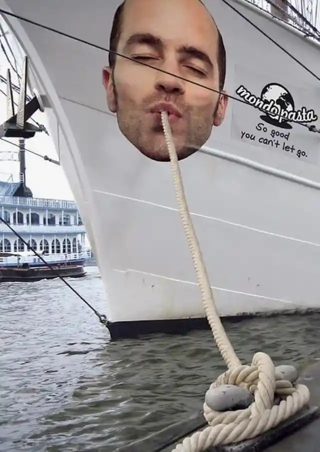

It looks like the person is happily slurping the pasta (which is disguised as the mooring rope). Extra points for creativity go to the tagline of the product, “so good you can’t let go.” This may be a unique advertising method. However, Mondo thought it through as they spread these signs across Hamburg harbor, which is the biggest and busiest harbor in Europe. This ensured that their ad was seen by thousands of people visiting the harbor each day.
Axe Men’s Calendar Dates
Axe is widely popular, especially among men who want a deodorant that smells like cologne. Who doesn’t want to hit two birds with one stone, right? Though they know they are popular, they are still working hard on their advertisements, which is a good sign that they are competitive in the market.


At first glance, it’s hard to understand what this ad conveys, but they are suggesting that if you use Axe, your calendar will be full of dates since women can’t get enough of your smell. Using the building as an oversized calendar was a stroke of genius.
Max Factor Mascara
Here’s another ad that requires participation from the environment. Max Factor, a well-known make-up brand, utilized wet weather in their mascara advertisement. Women have a difficult time finding a mascara that doesn’t smudge, even if it gets wet.

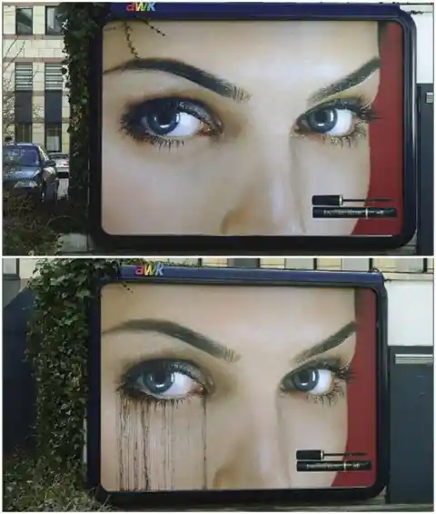
The mascara on the billboard is sensitive to rain. Once the billboard becomes wet, the cheap mascara looks like it’s running down the model’s cheek, creating lines that would emphasize a non-waterproof mascara. On the side of her face that has the Max Factor mascara, nothing is out of place. How clever is that?
The Hairy World of Science
We are already familiar with what Science World is. They are known for finding clever ways to spread awareness about their museum, and each ad promotes a different exhibit for people to visit.
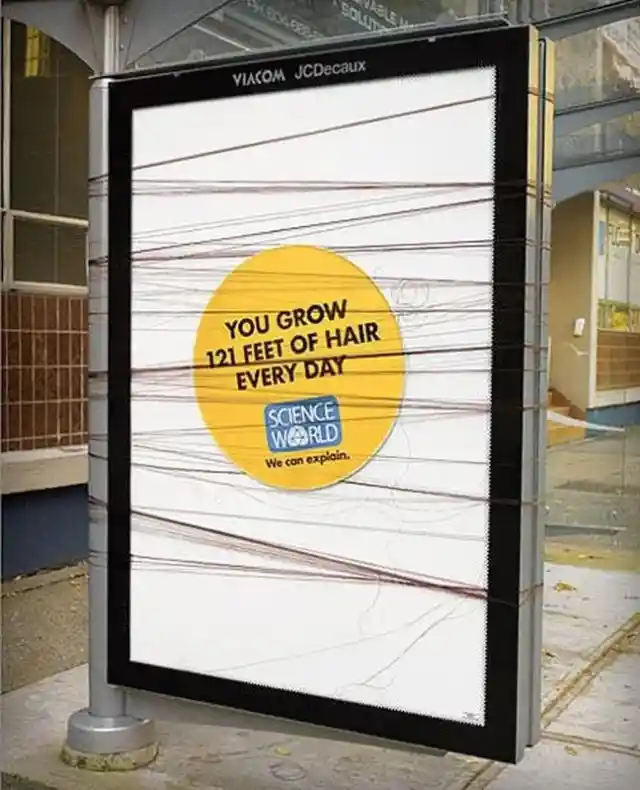
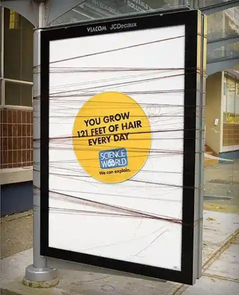
This bus stop advertisement highlighted a scientific fact that few people know about: “You grow 121 feet of hair every day.” While we want to learn more about this crazy scientific fact, we also want to touch the hair on that bus stop to see if it’s real!
Kill Bill 2
Billboards are a great way to build public anticipation for movies because they capture our attention while we’re going about our lives. However, the advertisers behind some films put in far more work than others. Kill Bill took it to the next level with this clever billboard that would make you want to get closer to investigate.

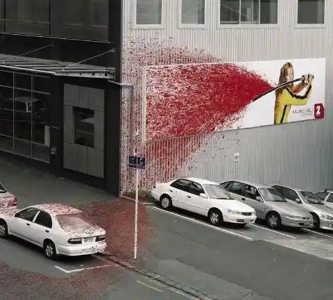
We are not sure if the car owners approved of this or if those blood-covered vehicles were all part of the marketing strategy, but whatever the story behind this is, we can all agree that it grabbed attention. We wonder why they put so much effort into marketing the film since the original was already such a hit. Still, kudos to the whole Kill Bill team for putting in this level of effort and creativity.
The Denver Museum of Nature and Science
The Denver Museum of Nature and Science is a Colorado-based museum that is a resource for informal science education in the Rocky Mountain region. Like any other science museum, it contains exhibitions, planetariums, an IMAX theater, and lectures that everyone can learn from and enjoy. However, their marketing strategy is different compared to the other promotions we’ve seen for science museums.
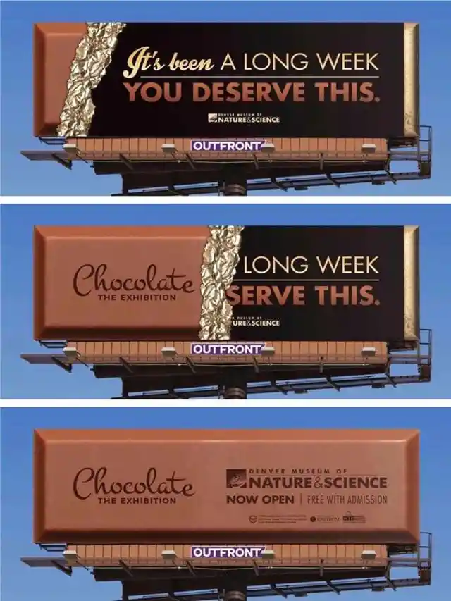
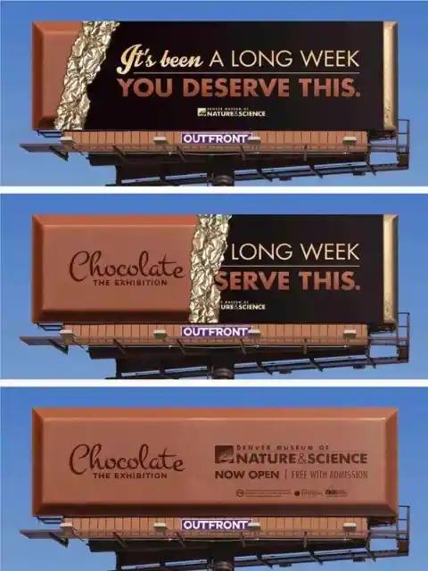
The Denver Museum chose an unconventional method for promoting their services by having a bar of chocolate as their main concept. We think that this idea is clever because everyone loves chocolate, right? A lot of people would take a look at the billboard to see the brand of the big chocolate. To their surprise, it comes from the Denver Museum. The tagline, “It’s been a long week, you deserve this” portrays that after a week of stress at school or work, we often crave something sweet and comforting, just like a chocolate bar.
The Powerful Powerhouse Gym
Usually, billboards offer straightforward messages with minimal text and graphics. They are generally also posted on the side of major roads and freeways. However, there are no rules in advertising, and in the real world, businesses have to keep up with the needs and shrinking attention span of the consumers to be able to keep pace with the competition.

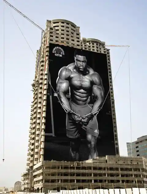
This billboard was perfectly executed with the use of the two cranes on the building. It symbolizes how strong you will be once you enroll in their gym. Of course, it’s exaggerated, but then again, there are no official rules for advertising right? If you have a wild imagination, you can fill people with hope for their health and their future, just as Powerhouse Gym did with this monumental ad.
Craftsman’s Crafty Ad Campaign
Oversized things work in advertising. If oversized office suppliers, razors, cookware, and gym equipment can work, there’s no reason why an oversized Craftsman wrench wouldn’t be equally successful.
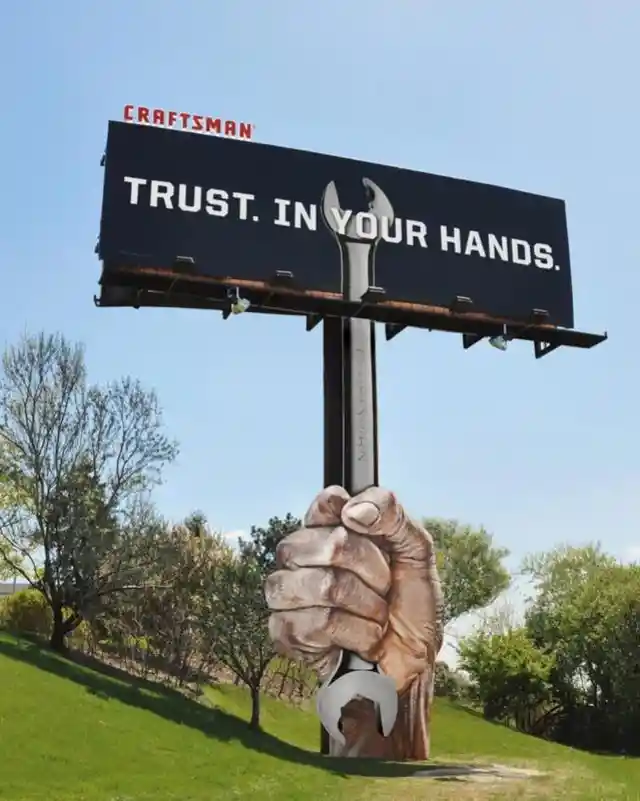

The tagline, “Trust. In your hands” takes the giant ad to another level. It means that when you are using the Craftsman’s wrench, you will be in good hands, just as the wrench is in good hands with you.
Xenon Mini Cooper
“Let there be Xenon” sounds familiar, right? It is remarkably similar to the biblical quote, “Let there be light”. Xenon was brave enough to reference the bible when advertising the Mini Cooper.

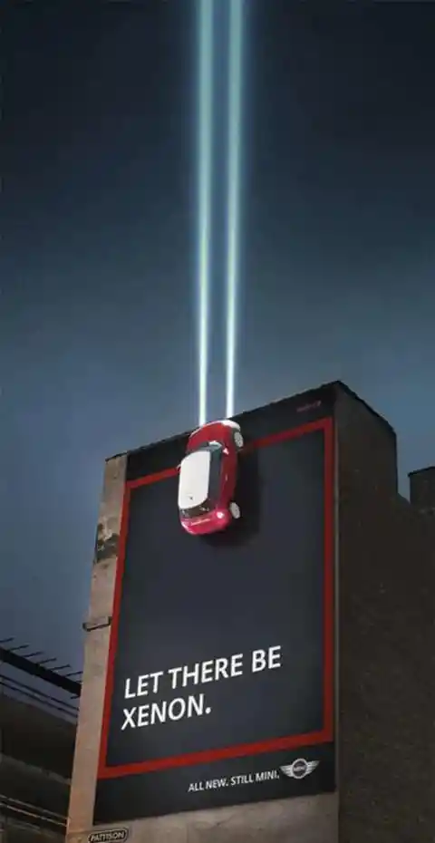
In this day and age, having an eye-catching advertisement is a must. This is why many companies are willing to pay a large amount of money just to create an advertisement that will surely be a hit. Xenon’s gravity-defying Mini Cooper is up there… literally!